

Charts in Confluence are an extremely useful tool when you want to show data in a visual matter. Excellentable allows you to create dynamic and interactive charts and share them with your teams. Anyone can look at a bunch of data in a spreadsheet and maybe pull out a couple of things from it, but the moment someone converts that data into a chart changes everything. Charts can take large pieces of data, or several pieces of data, and allow any user to see basic things from a single glance. In this blog, we will be talking about Column Charts and what instances they can be used in.
What Confluence charts can Excellentable create?
Excellentable offers several widely used charts to our users. What charts are available? Well, the fan favorites of Bar, Column, Pie, Area, Line, and Scatter charts are what we offer. We know there are plenty of other charts available out there, and we do plan on adding more, but we started with some of the big ones. In today’s blog, we’ll be looking at Line Charts and Scatter Plot Chart
What is a Line Chart?
A line chart (aka line plot, line graph) uses points connected by a line from left to right to demonstrate changes in value. The horizontal axis depicts a continuous progression, often that of time, while the vertical axis reports values for a metric of interest across that progression.
Use Case 1 – New Subscriptions Over Time
As an executive for my company, I wanted to see a list of new subscriptions for the year of 2022. Specifically, I want to see how new subscriptions grew over the year of 2022 month by month. After getting the number together I drop them all into an Excellentable.
After inserting the data I can easily convert the data into a chart. It’s just a few clicks and there it is!
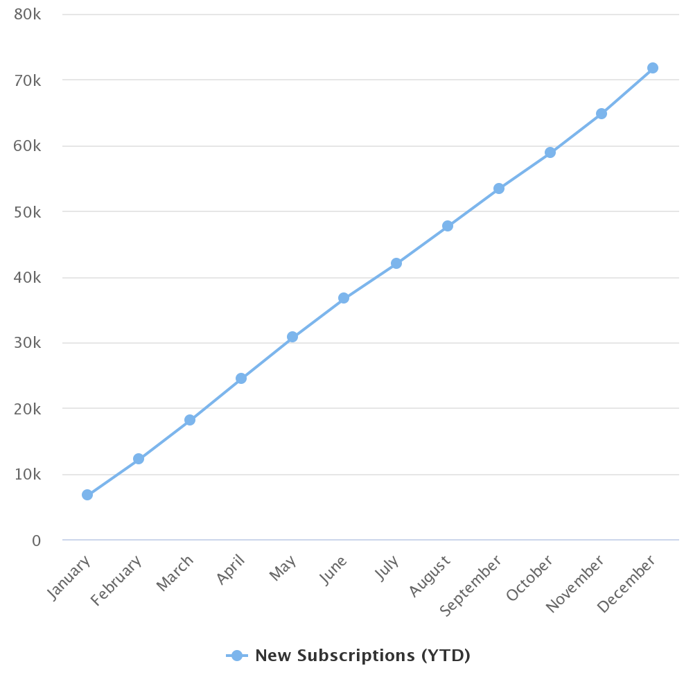
Now that I have this chart I can use it while I’m giving presentations to stakeholders, executives, investors, etc. It gives a simple view of how much the subscriptions have grown over just one year.
What is a Scatter Plot Chart?
A scatter plot (aka scatter chart, scatter graph) uses dots to represent values for two different numeric variables. The position of each dot on the horizontal and vertical axis indicates values for an individual data point. Scatter plots are used to observe relationships between variables. Scatter plots’ primary uses are to observe and show relationships between two numeric variables. The dots in a scatter plot not only report the values of individual data points but also patterns when the data are taken as a whole.
Use Case 2 – Best Time to Fish
I’m a professional fisherman. I’ve been trying to find the best time and temperature to catch the most fish. To figure that out I start recording the exact temperature when I catch a fish and keep adding to it over the course of 6 months. After 6 months I get this.
I take that data and drop it into a Scatter Plot chart to see if there is any sort of correlation or if it doesn’t have any effect. After creating the chart I get this.
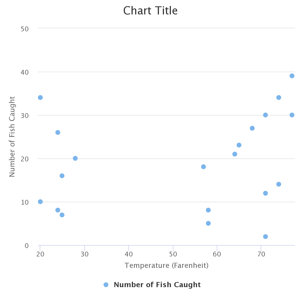
Based on what I’m seeing there really isn’t a correlation. There does seem to be more at the 60-70 degree Fahrenheit mark, but it isn’t super conclusive. After doing this I find out there really isn’t a correlation where I’m fishing. Time to figure out another data set to improve my catch rate.
What else can charts do?
Just as Excellentable is always adding, Charts will be as well. As I mentioned earlier, more charts will be coming, improvements to the formatting and function of charts, and even things like creating an Excellentable from a Confluence table, just like creating a confluence graph from the table. All kinds of fun things!!! Look forward to improvements and changes in the future.
Visit our Excellentable help page to learn more or to the Excellentable page to start a free trial.
See more posts by Jason Mcgee


2 Responses
Good Afternoon Jason McGee, hope this message finds you doing well. I am working on a project for the team and would like to ask a few questions about Excellentable file in Confluence. When collaborating with over 10+ ppl using the same file what are the pros and cons? I noticed that the filter option is a standard view for all users to view the same information. I would appreciate if you could please advise.
Thank you in advance.
Maria Monsivais
Hi Maria,
The collaborative editing becomes a bit unstable when you have about 8-10 users in the queue. You still will be able to edit collaboratively, but will need patience from all parties as the responsiveness goes down. If you are on Datacenter version, we highly recommend getting the collaborative editing behind firewall, as you are not sharing the collaborative editing services with anyone.
I did not understand your question about filters. Can you please raise a ticket at our support portal for this, as that will be a better place for extended communication.
https://addteq-software.atlassian.net/servicedesk/customer/portal/13
Regards
Shardul Juyal