In the fast-paced world of data-driven decision-making, conveying complex information clearly and compellingly is crucial. Enter Excellentable, a powerful tool that empowers users to create stunning charts and graphs in Confluence for effective data visualization. In this blog, we’ll explore the art of data visualization and how Excellentable can elevate your charts to new heights.
The Power of Data Visualization
Data visualization is more than just creating aesthetically pleasing charts; it’s transforming raw data into meaningful insights. Well-designed visualizations can simplify complex information, highlight trends, and facilitate better decision-making. Whether you’re presenting to stakeholders, analyzing trends, or trying to understand patterns, the right visualization can make all the difference.
Introduction to Excellentable
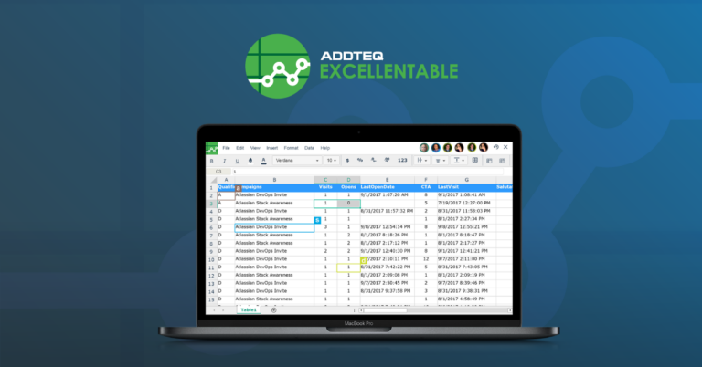
Excellentable is a collaborative spreadsheet tool, that takes data visualization to the next level. Built on the familiar interface of spreadsheets, it seamlessly integrates advanced charting capabilities, allowing users to create dynamic and interactive visualizations effortlessly. Here are some key features that make Excellentable stand out:
- Real-time Collaboration: Excellentable allows multiple users to work on the same spreadsheet simultaneously, fostering collaboration among teams. This real-time collaboration feature ensures that everyone is on the same page, making data analysis a collective effort.
- Wide Range of Chart Types: From basic line charts to complex heatmaps, Excellentable supports a diverse range of chart types. This versatility enables users to choose the most suitable visualization method for their specific data set, enhancing clarity and understanding.
- Interactive Elements: Static charts are a thing of the past. With Excellentable, you can create interactive charts that respond to user inputs. Whether it’s a clickable pie chart or a drill-down bar graph, interactivity adds a layer of engagement to your visualizations.
Creating Stunning Visualizations with Excellentable
Let’s delve into the steps to create visually appealing charts and graphs in Confluence using Excellentable:
1. Organize Your Data:
Before diving into the world of visualization, ensure your data is well-organized. Arrange your information in a structured manner within the Excellentable spreadsheet.
2. Select the Right Chart Type:
Choose a chart type that best represents your data. Excellentable offers a variety of options, including bar charts, line graphs, scatter plots, and more. Consider the nature of your data and the story you want to tell.
3. Customize Your Chart:
Excellentable provides extensive customization options. Adjust colors, fonts, and labels to match your brand or convey specific information. Tailor your chart to enhance readability and visual appeal.
4. Utilize Interactive Features:
Take advantage of Excellentable’s interactive features. Incorporate tooltips, clickable elements, and dynamic filters to make your visualizations more engaging and user-friendly.
5. Label Your graphs:
A small thing that changes the readability of graphs in Confluence is simply naming the graph and labeling the axis. Labeling graphs increases the readability manyfold and creates a quick summary of the data in the reader’s mind.
6. Emphasize Key Insights:
Use visual elements such as annotations and callouts to highlight crucial points in your data. Draw attention to trends, outliers, or significant events contributing to a more compelling narrative.
You can also go through our full documentation here.
Conclusion: Elevate Your Data Storytelling with Excellentable
In the era of big data, the ability to distill complex information into clear and compelling visualizations is a valuable skill. Excellentable simplifies the process and adds a layer of collaboration and interactivity, making your charts and graphs more powerful than ever.
Harness the capabilities of Excellentable to create visualizations that not only inform but inspire action. Elevate your confluence storytelling and unlock the potential of your insights with Excellentable’s data visualization excellence.