Welcome back to another riveting blog of Pivot Tables – What they can do for your Confluence! Today, we’re going to be talking about another use case for Pivot Tables. The first time we talked, we talked about how to take a large set of data and easily pull a count of orders per state for the year of 2021. This time we’re going to talk about something a little different. Today, I want to know the expiration year of subscriptions for a large subset of orders. Even more so, I want to know what they are per state. Excellentable lets you create quick, dynamic and editable MIS reports and pivot tables in Confluence on the fly.
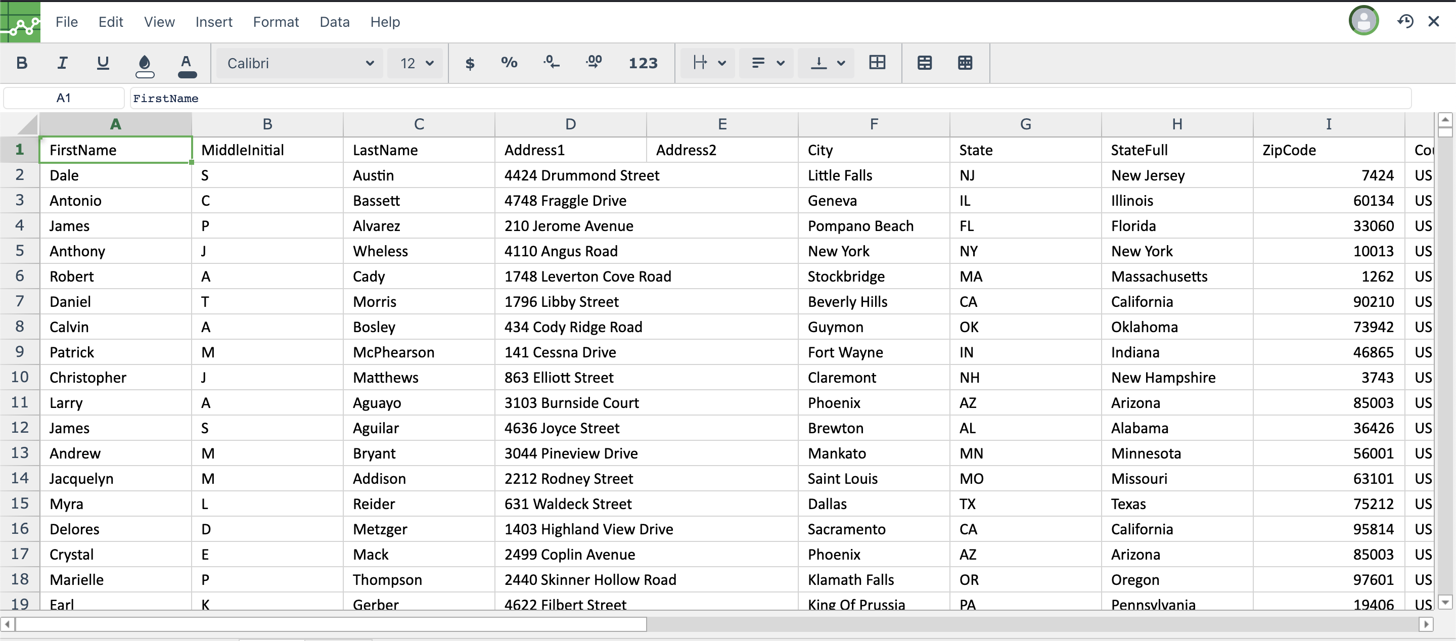
We currently have 2500 active users for our subscription service. It has all kinds of data that I could need. Name, address, subscription expiry year, subscription expiry day, etc. But our CEO wants to get an idea of how many renewals we will be having in the next couple of years. The only problem is I have 2500 lines of subscriptions to go through.
I have a couple options to find that data. I could add a filter and go year by year manually counting the subscriptions. There aren’t a lot of years but it’s still a lot of data to go through. I could use some crazy formula to figure out how many, I’d still have to go year by year though. This would probably take a little less time but not by much. And all this is to just get the count of subscription expirations by year. The fastest, and easiest, option is to easily take those 2500 lines of data and create a pivot table from them.
Let’s go the Pivot Table route since this will probably take me a couple minutes to get the info I need.
First step is to take the data in Excellentable and create a Pivot Table from it. That’s easy enough. I select all the data in the order export and select “Pivot Table” from the “Insert” menu item.
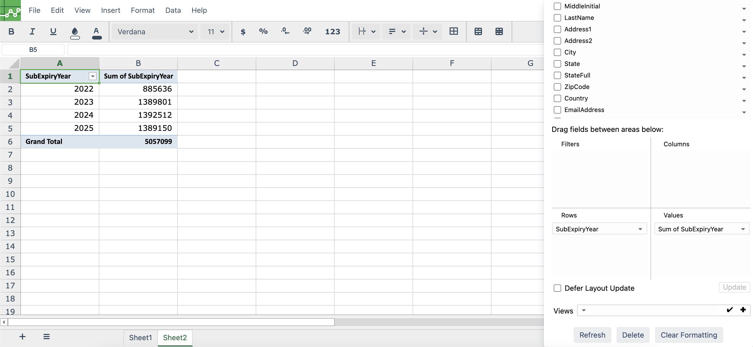
From here it’s just putting the right data into the right fields to get the information I need. Luckily, I know exactly what I want to do. I take the “SubExpiryYear” field and drop it into the “Rows” section. After that, I take the “SubExpiryYear” field and drop it into the “Values” section. Suddenly, I have a table available to me that shows me exactly how many subscriptions will expire in the appropriate years
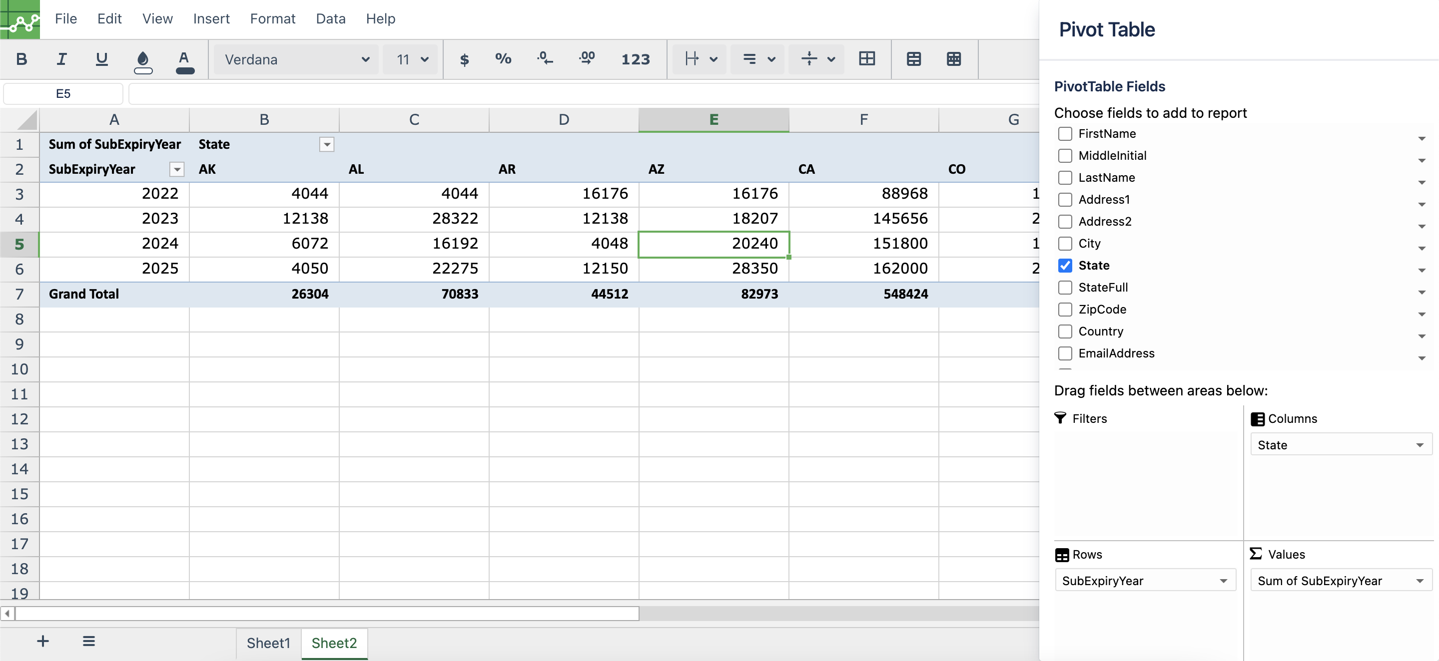
But what about the state addition? That’s an easy addition to the Pivot Table. All I have to do is drag the “State” field down to the “Columns” section and suddenly I have it broken out by state.
Pivot Tables are great at taking large amounts of data and condensing them down to much more manageable chunks to get exactly what you need.
Stay tuned for more examples of how Pivot Tables can be used in Excellentable.