Say hello to your new favorite feature in Excellentable! Charts for Excellentable are here!
What are Charts?
Charts, or Graphs depending on who you’re talking to, is a powerful tool that allows users to visually display data in a variety of formats. It is a visual representation of data from a worksheet that can bring more understanding to the data than just looking at the numbers. Depending on the data you want to visualize, there are several different types of charts to give the users the best possible way to use Charts effectively.
What are the benefits of Charts?
As I said above, charts are just a powerful tool. Most people can’t look at a large dataset and accurately digest the meaning behind the numbers. With Charts, that data can be turned into a visual display that easily lets the user digest EXACTLY what the data is trying to tell you. Whether it be falling profits, rising costs, increased subscriptions in a specific market. Charts allow the users to effectively show what is happening and make it digestible to the average user.
What types of Charts are in Excellentable?
While we plan on greatly expanding our available charts, we’re only starting with the 6 most used charts. Area, Bar, Column, Line, Pie, and Scatter. We will be expanding these over time but we wanted to hit the big ones first.
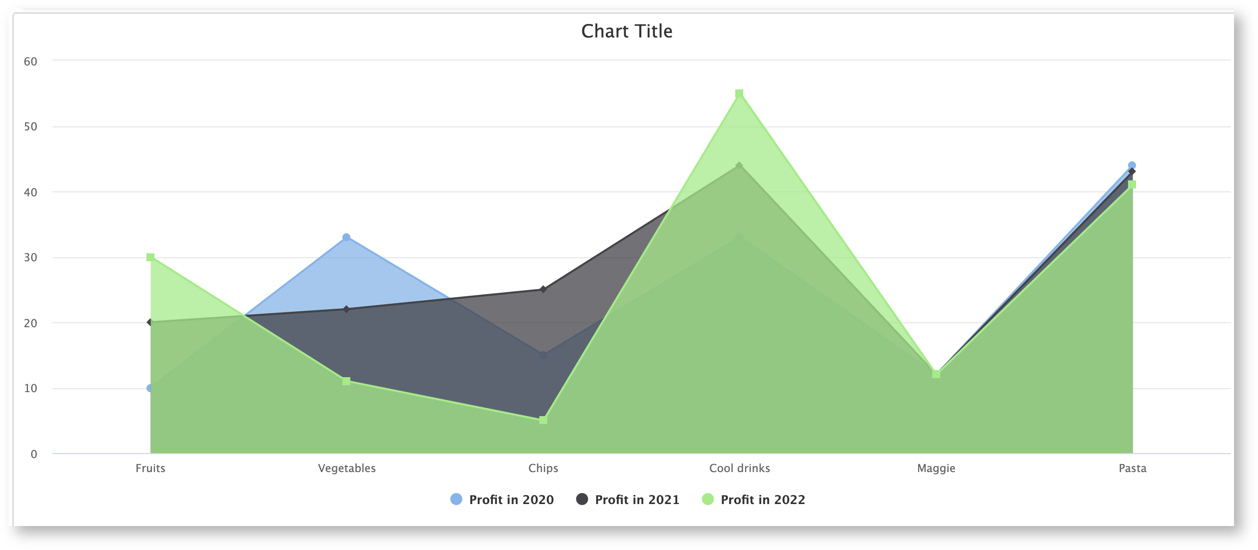
Area
The area chart works the same way as a line chart, but instead it fills in the area between the line and the x-axis. Area Charts can be used to plot the change over time and draw attention to the total value across a trend. By showing the sum of the plotted values, an area chart also shows the relationship of parts to a whole.
Bar
The bar chart is exactly the same as a column chart; only the x-axis and y-axis are switched. Bar Charts illustrate comparisons among individual items. In a Bar Chart, the categories are organized along the vertical axis and the values are organized along the horizontal axis.
Column
A Column Chart typically displays the categories along the horizontal (category) axis and values along the vertical (value) axis.
Line
Line charts can show continuous data over time on an evenly scaled Axis. Therefore, they are ideal for showing trends in data at equal intervals, such as months, quarters or years.
Pie
Pie charts show the size of items in one data series, proportional to the sum of the items. The data points in a pie chart are shown as a percentage of the whole pie.
Scatter
Scatter charts are typically used for showing and comparing numeric values, like scientific, statistical, and engineering data.
What’s next for Charts?
I don’t want to give away any surprises but we have a number of improvements planned for the Charts functionality in the future. Everything from general improvements, new chart types, and even something pretty special that I’m personally looking forward to. Keep an eye out over the rest of the year for some exciting things coming.